
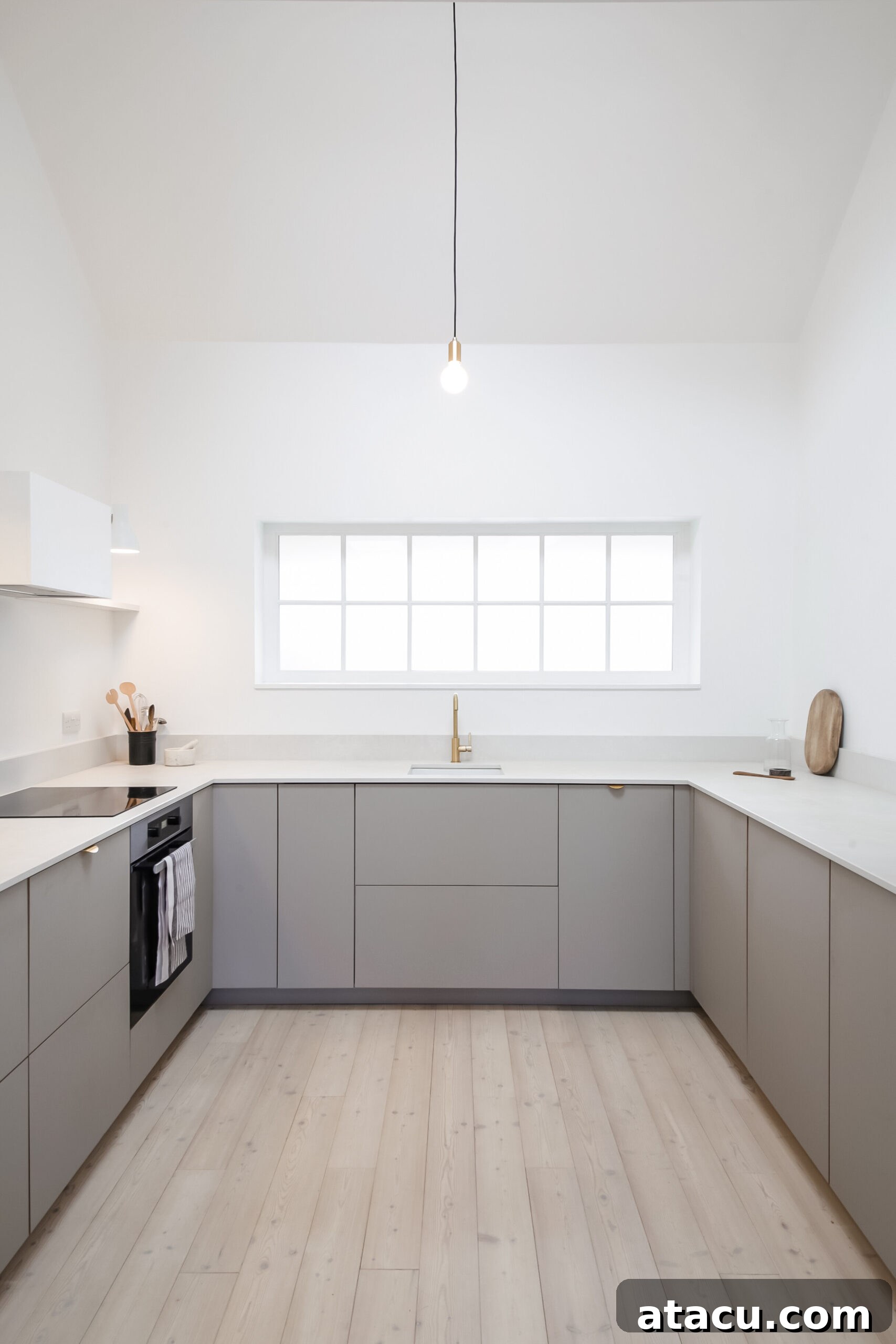
After months of dedicated effort, the final touches on our new kitchen and dining space are complete, and we are thrilled to finally share its reveal with you. Initially, I hesitated to post something as seemingly trivial as a kitchen reveal during such unprecedented times. The world felt heavy, and the thought of sharing a home renovation seemed almost insensitive.
However, as weeks turned into a month of lockdown, many of you reached out, expressing how much you appreciate the occasional glimpse into interior projects – a welcome distraction from the constant news cycle. Perhaps you’re embarking on a similar project yourself, or extended time at home has inspired you to reconsider how your current kitchen functions. Whatever your motivation, I sincerely hope you find inspiration and enjoyment in our start-to-finish renovation journey, detailing how we designed and built our dream kitchen and dining area.
For those new to our project, you might find it helpful to catch up on the earlier stages. In Part 1, I discussed our initial planning process and the conceptual design. Then, in Part 2, I provided an update on the first phase, sharing images of the extension’s shell as we prepared for the internal fit-out. Today, in this highly anticipated Part 3, I am delighted to unveil the finished space in all its glory.
From Concept to Creation: Our Kitchen Extension Story
Let’s rewind to the beginning. When we first moved into our house, it suffered from a severely undersized and woefully outdated kitchen. It was barely functional, making a new kitchen extension our top priority. The plan involved demolishing an old, neglected garage at the side of the property and constructing a brand-new side extension in its place. We personally conceptualized the design for this transformative project before engaging an architect to translate our vision into detailed plans. If you’re curious about the initial layout, I previously shared the plans here.
Our builders commenced work on the extension last January, swiftly completing the structural shell within approximately three months. The pace then shifted as we took on the extensive internal fit-out ourselves, transforming bare plaster walls and a concrete subfloor into the stunning space you see today. This was a long and arduous process, covering everything from plumbing and fitting cabinetry to laying the floor, installing windows, and finally, painting and decorating. While I say ‘we,’ it’s important to acknowledge that Graham shouldered the majority of the hands-on work. Nevertheless, it was unequivocally a team effort, and I contributed wherever I could.
You can revisit the raw, unfinished shell of the space after the builders’ departure here. Our builders were exceptional, but by undertaking most of the interior work ourselves, we achieved a much higher specification and finish than would have been possible within our budget. The trade-off, of course, was living in temporary disarray for several months, making do with the most basic kitchen facilities: a cheap two-ring electric hob, a microwave, and a tiny fridge. We certainly became experts in ready meals during that period!
Designing with Light: The Architectural Elements of Our New Kitchen
The new internal space is beautifully defined by a high vaulted ceiling at the front and a flat-roofed section at the rear. To maximize natural light, we integrated three roof lights, strategically positioned to capture illumination from various directions. A bespoke feature window above the sink at the front of the space creates a striking focal point, while elegant Crittall-style doors open out onto the garden at the rear, blurring the lines between indoor and outdoor living. These exquisite doors were expertly supplied and fitted by Cherwell Windows, chosen from their Aluco Elegance range. Eventually, they will lead to a planned decked area, completing our outdoor vision. We eagerly anticipate tackling the garden project this year, as soon as supplies become readily available.
The custom glass for the prominent front window was sourced from a local supplier, and Graham meticulously constructed its bespoke timber frame. We drew inspiration from 1930s-style garage doors to ensure the extension harmonized seamlessly with the existing external character of our property. From the front of the house, the new extension could almost be mistaken for a garage – an intentional element of surprise that we adore. Stepping inside and discovering the truly lovely, expansive kitchen rather than a humble garage creates a delightful moment. To further integrate the new structure, we clad the roof in reclaimed tiles, prompting one kind neighbor to comment, “it looks as though it could have always been there.” This feedback perfectly encapsulates our goal of creating a modern addition that feels timeless.
Crafting Functionality: Planning Our Modern Minimalist Kitchen Layout
When planning a new kitchen, it’s crucial to address the often-overlooked functional elements long before you delve into aesthetic design. This unglamorous, yet absolutely vital, stage ensures the space works efficiently and effectively. Early decisions must be made regarding the placement of all services and utilities – plumbing, heating, electrical sockets, and switches. Modifying these decisions later in the project can be complex and expensive, highlighting the importance of thorough initial planning.
As we mapped out the dimensions of our new space, it became clear that accommodating a kitchen island would be a tight squeeze, potentially compromising flow and usability. While we could have forced one in, it likely wouldn’t have optimized the space. In our previous home, we enjoyed an open-plan kitchen-living area with a peninsula that successfully delineated the zones. We considered replicating this, but ultimately, our overarching design principle was to maintain an open, spacious, and airy feel. This guided us towards a U-shaped layout, complemented by a few carefully selected open shelves, a custom-built extractor fan cover, and a deliberate absence of full-height units. This configuration maximized visible space and upheld our minimalist aesthetic.
Our practical approach involved purchasing base units from IKEA, then ordering custom doors and drawer fronts to personalize the look. We literally started with a blank sheet of paper, sketching various design layouts and ideas until we landed on one that satisfied us both. Following this, we booked an appointment with a highly knowledgeable kitchen designer at our local IKEA store, who meticulously drew up the detailed plans based on our bespoke design.
Budgeting for Our Dream Kitchen Extension: The DIY Advantage
For those curious about the financial aspect, providing an exact cost for our project is challenging because we achieved substantial savings on labor by undertaking nearly all the internal work ourselves. This wasn’t a “cheap” build; our priority was to achieve a high-quality finish with meticulous attention to detail. However, as a rough estimate, I would confidently say that our DIY approach saved us approximately 40% of the total internal fit-out cost. This significant saving allowed us to invest in a much more high-specification kitchen than would have otherwise been financially feasible, truly bringing our vision of a luxury, minimalist kitchen within reach.
Choosing the Foundation: Flooring for Our Modern Kitchen
Our initial thought was to extend the beautiful oak parquet flooring from our lounge and hallway into the new kitchen. Typically, I advocate for consistent flooring materials across connected spaces to foster a seamless sense of flow. However, in this instance, I chose to depart from my own advice – a gamble that, I believe, paid off handsomely. Instead, we opted for larch flooring, driven by two primary considerations.
Firstly, cost was a factor. While we adored the oak parquet, it was an expensive choice, and we had already overspent in other areas of the house beyond our original projections. Secondly, upon entering, the new extension distinctly feels like a different zone from the older part of the house. It possesses a light, airy, modern, and unequivocally minimalist ambiance, and we sought a flooring material that would harmoniously reflect this unique character. We purchased untreated larch and painstakingly applied a lye and Osmo oil finish, meticulously achieving our desired aesthetic. The process was similar to a technique we previously employed on the upstairs flooring in the bedrooms. While undoubtedly time-consuming and labor-intensive, it allowed us to attain the precise color and finish we envisioned.
Larch is technically a softwood and less commonly used for flooring than hardwoods like oak. However, despite not being as hard as oak, it offers considerably more resistance to wear and tear than standard softwood floorboards. Several months on, I am incredibly pleased with how it’s performing under daily use. Its light color means it shows dirt more readily, but it cleans up remarkably well with just a bucket of soapy water and a mop, consistently looking stunning.
Crafting the Core: Our Minimalist Kitchen Cabinets
From the outset, we had a very clear vision for the overall form and feel of our kitchen: light, airy, and undeniably minimal. However, translating this into the actual cabinet choice proved to be a more protracted decision-making process. Initially, I contemplated traditional shaker-style cabinets paired with a marble-effect worktop, believing this classic aesthetic would complement our 1930s house. While I appreciate this timeless style, I also questioned if it might be too ‘safe’ a design choice. Shaker kitchens are popular for good reason, but we aspired to create something that felt uniquely ‘us,’ rather than a replication of a kitchen seen elsewhere.
Having committed to IKEA base units, we turned to Husk for custom doors and drawer fronts. For those interested in the bespoke fronting process for IKEA units, I may dedicate a separate post to it in the future. Husk expertly guided us through the selection process, providing invaluable advice. We were genuinely impressed by the exceptional quality of the doors and drawer fronts upon their arrival.
If you’re considering the custom door route, my strongest advice is to take your time. Gather as many color and material samples as possible and use them to construct a physical mood board. This tactile approach allows you to touch, feel, and experiment with combinations, envisioning them alongside your chosen worktops, flooring, and even tap finishes. Resist the urge to rush the decision. We lived with our mood board for several weeks, observing how the samples appeared in different lighting conditions throughout the day. This extended period allowed us to fully commit to our cabinet choice, ultimately preventing a potentially costly mistake. We only moved forward when we were 100% confident in our selection.
Our chosen doors and drawers are crafted from plywood and feature a matt, soft-touch, anti-fingerprint FENIX surface. We opted for a sophisticated oak trim on the edges, which imparts a subtly more luxurious feel, though the exposed ply edge sample from Husk also looked fantastic. To further enhance the clean-lined, minimalist aesthetic, we chose a handleless finish. All doors and drawers are push-to-open, with the exception of the dishwasher cabinet and cutlery drawer – frequently used items where a simple pull handle offers quicker, easier access. This handleless design beautifully contributes to the sleek, uncluttered look of our kitchen.
The Heart of the Kitchen: Our Caesarstone Worktops
For this project, we had the privilege of collaborating with Caesarstone, who generously supplied our stunning worktop: Cloudburst Concrete from their Metropolitan Collection. To truly appreciate the surfaces on offer, we highly recommend visiting a showroom to see large expanses rather than just small samples. This immersive experience is invaluable before committing to such a significant surface. During the design process, it often pays to maintain an open mind rather than being rigidly fixated on an initial idea.
We had originally leaned towards Statuario Maximus from Caesarstone’s Supernatural Collection, captivated by its striking veined effect. However, when we visited the showroom, we brought samples of our chosen flooring and cabinet color and finish. Seeing these elements together next to the large slabs of worktop, our perspective shifted. While we admired Statuario Maximus, the contemporary, industrial feel of Cloudburst Concrete resonated more deeply with our personal style – it felt more ‘us.’ Its subtle, nuanced tones perfectly complemented the other elements we had already selected for the kitchen, and the choice just instinctively felt right. When the fabricators arrived to install the worktops, there was an immediate sense of reassurance; we knew we had made the perfect decision. We opted for a sleek 20mm worktop with a simple upstand, maintaining the clean, minimal, and understated design we desired. Our sincere thanks go to Caesarstone for their invaluable support, and to Bellaggio, whom we engaged for the expert fabrication and installation.
Refined Utility: Sink and Taps Selection
Given our commitment to an overall minimalist aesthetic, the selection of the tap became an unexpectedly crucial decision, as it naturally draws more attention in a pared-back space. We chose the Althia single lever mixer tap by Abode. It serves almost as a piece of jewelry, adding a touch of understated elegance to an otherwise unembellished room. The brushed brass finish possesses a beautiful, subtly desaturated tone – not overly ‘yellow’ – which truly completes the space. Alongside the elegant ceramic undermounted sink, these fixtures were kindly supplied by Abode, and their quality and design have exceeded our expectations.
Smart Choices: Kitchen Appliances for Modern Living
For our primary cooking needs, we selected a reliable Miele oven, known for its performance and durability. To handle daily cleanup efficiently, a Bosch slimline integrated dishwasher was the perfect discreet solution. We initially considered integrated counter-level fridge and freezer units, similar to our previous home, to maintain the light and open feel of the kitchen. However, a deep-seated desire for the luxury and convenience of a large American-style fridge freezer persistently nudged at us. We were somewhat daunted by their sheer size, concerned that a typical model would overwhelm our new space.
Then, serendipitously, we discovered this particular model from Fisher & Paykel. It offered a slightly more compact footprint than most other American-style units we had researched, yet still provided ample storage capacity for the two of us. It felt like a significant extravagance at the time, but having saved so substantially on other elements of the renovation through our DIY efforts, we decided to treat ourselves. Honestly, it has proven to be one of the best decisions we made. It has transformed cooking and meal planning into a far more enjoyable experience, and crucially, it keeps food fresh for so much longer – no more prematurely discarding a bag of lettuce after just a couple of days!
During the recent lockdown period, I have been immensely grateful for a fridge freezer large enough to store two weeks’ worth of provisions, eliminating the need for frequent “top-up” trips to the shops. We absolutely love it, and it underscores how the right appliances can genuinely enhance daily living.
Illuminating the Space: Our Thoughtful Lighting Design
When it came to lighting, we once again adhered to our minimalist principles. The elegant wall lights positioned above the open shelving units are by Anglepoise, offering focused illumination with classic style. Above the artwork, a discreet picture light by Astro highlights the piece without drawing undue attention to itself. For the primary pendant lights, we chose a matt white bulb set within a stylish brass fitting by Tala, complemented by a simple paper lantern. While the paper lantern may eventually be replaced, it perfectly serves its purpose for now, embodying our belief that simple design is often the most effective.
We are incredibly proud of what we have achieved with this space. The quality of the natural light here is truly beautiful, making it an exceptional environment for photography – I am genuinely excited to utilize it for my work in the coming months. More importantly, though, it has simply become a wonderfully pleasant place to spend our time, whether cooking, dining, or simply enjoying a quiet moment.
To anyone currently immersed in the challenging, yet rewarding, process of a kitchen renovation or extension project and feeling as though it will never end, please trust me when I say: it will absolutely be worth every effort. For us, this has been a protracted journey. While not our first renovation – we acquired valuable lessons and skills undertaking work on our old house, so we weren’t complete novices – it undeniably took its toll at various points. Yet, when we first embarked on this project more than a year ago, we could never have foreseen just how vital this space would become to us.
I have always believed that our homes should function as sanctuaries, and this truth has never resonated more profoundly than during the past few weeks. This new space genuinely uplifts me, filling me with a sense of light and calm every time I enter. So many aspects of life are currently beyond our control, but the act of baking and preparing healthy meals in this beautiful room we’ve created feels like something I can take charge of, a small yet significant anchor in uncertain times. Right now, I deeply need and am profoundly grateful for that sense of agency. Sometimes, good design truly can be life-enhancing, offering comfort and joy far beyond mere aesthetics.
Planning your own kitchen transformation? Explore these 21 stunning ideas for kitchen extensions for inspiration.
Comprehensive Source List for Our Modern Kitchen Extension
worktops – Caesarstone* | worktop fabrication – Bellagio | tap – Abode* | sink – Abode* | flooring – Russwood | cabinets – IKEA base units with custom door and drawer fronts by Husk | black patio doors – Cherwell | glazed black internal door – Doors to You | dining table – vintage | black dining chairs – Hay | cane bentwood chair – vintage | pendant light – Tala | oven – Miele | fridge – Fisher & Paykel | wall lights – Anglepoise | glass decanter – Skagerak* | teapot – Robert Welch (vintage) | tableware – M&S*
Ad disclosure – We gratefully collaborated with Caesarstone and Abode on this project. Items marked with an asterisk (*) were kindly supplied by the respective brands.
All images © Helen Powell.