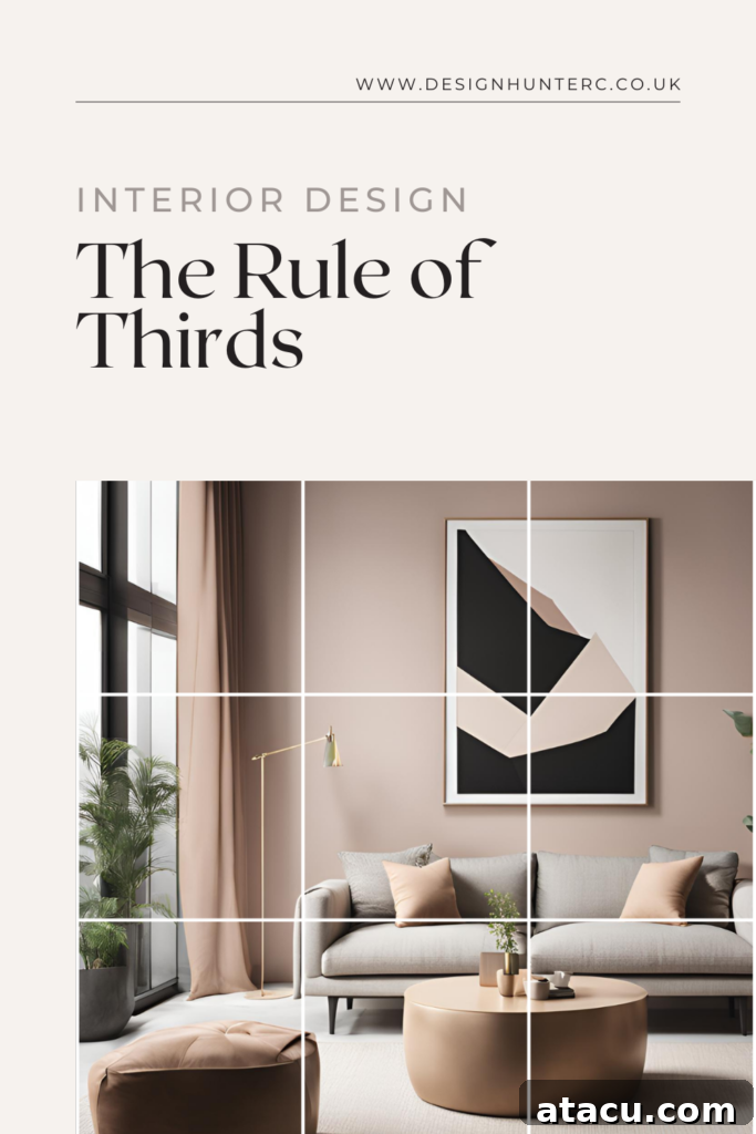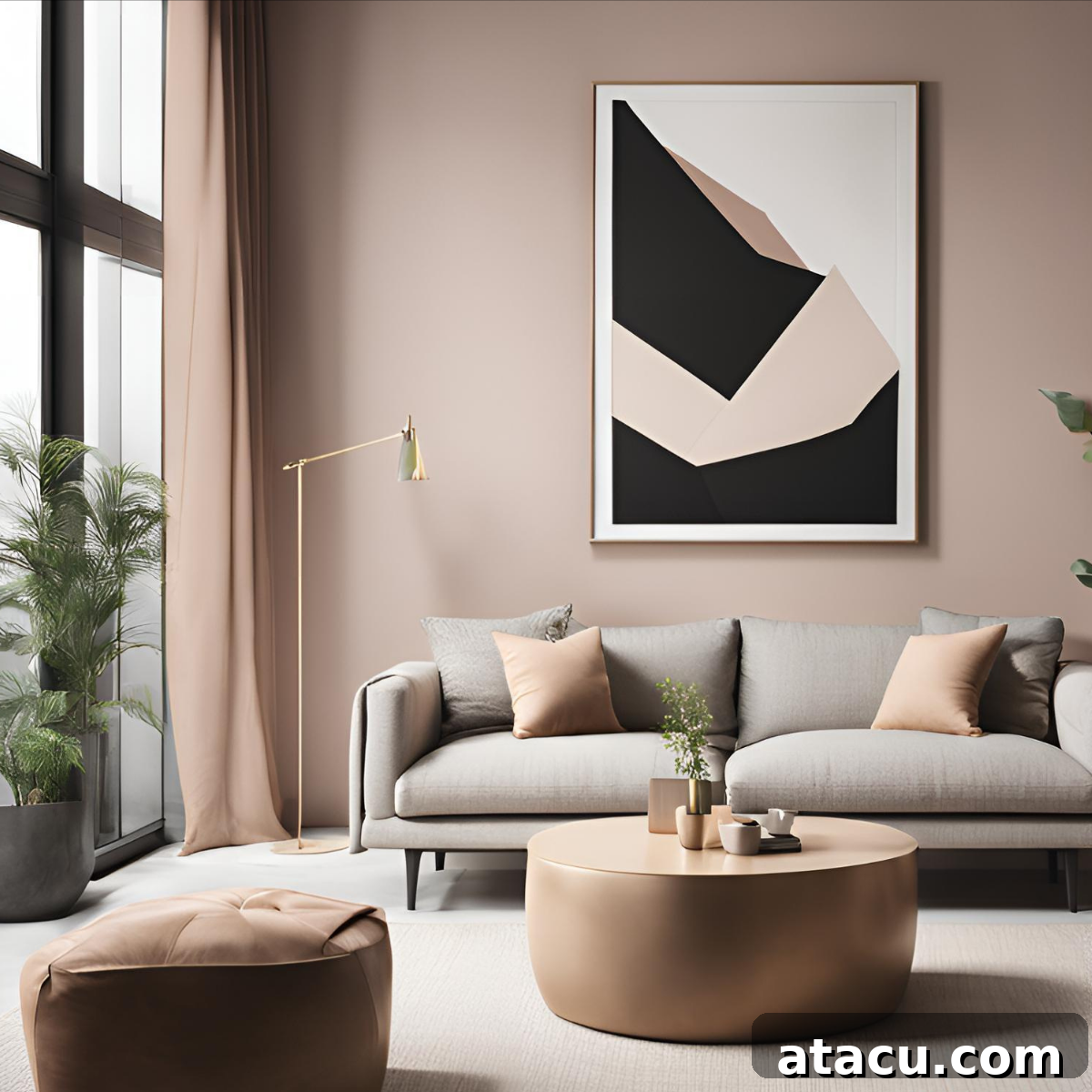
Mastering Visual Harmony: The Rule of Thirds in Interior Design
Ever walked into a room and felt an immediate sense of calm, balance, and visual appeal, even if you couldn’t quite pinpoint why? Chances are, you’ve experienced the power of the Rule of Thirds in interior design. This timeless compositional principle, elegantly borrowed from the realms of photography and fine art, serves as an invaluable guide for creating spaces that feel inherently pleasing, dynamic, and cohesive. It’s not just about aesthetics; it’s about crafting environments that resonate with our innate human perception of beauty and order.
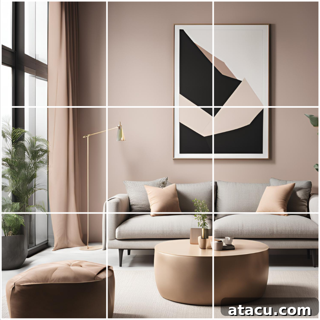
At its core, the Rule of Thirds involves conceptually dividing any given space into nine equal segments using two equally spaced horizontal lines and two equally spaced vertical lines. These lines create a virtual grid, and their four intersection points are often referred to as “power points” or “sweet spots.” Our eyes are naturally drawn to these intersections, making them ideal locations for placing key design elements, focal points, or areas of interest. By understanding and applying this simple yet profound guideline, designers and homeowners alike can transform ordinary rooms into extraordinary havens of visual harmony and sophisticated style.
Understanding the Mechanics: How the Rule of Thirds Works
To implement the Rule of Thirds, imagine overlaying a transparent 3×3 grid onto your room or a specific wall. This mental (or even physical, using temporary tape) division creates nine distinct sections. The magic happens when you position significant elements along these grid lines or, more powerfully, at their intersections. Instead of placing everything dead center – a common pitfall that can lead to predictable and sometimes monotonous designs – this rule encourages a slight, intentional asymmetry that feels more natural and engaging.
The principle dictates that a space divided into thirds, rather than halves, creates a more compelling visual narrative. For instance, if you consider a wall, instead of placing a large piece of art directly in the middle (50% mark), aligning it with the one-third or two-thirds mark immediately introduces more dynamism. Similarly, in an open-plan living area, using the grid to define distinct zones for dining, lounging, or working creates a structured yet fluid environment where each area feels purposeful and visually connected without being rigidly symmetrical.
Why This Principle Resonates: The Psychology Behind the Rule of Thirds
The effectiveness of the Rule of Thirds isn’t merely anecdotal; it’s deeply rooted in human psychology and the way our brains process visual information. Studies in visual perception suggest that compositions adhering to this principle feel more balanced, engaging, and less static than those where elements are simply centered or randomly placed. This preference for slight asymmetry over perfect symmetry prevents the eye from becoming bored and allows for a natural visual journey through the space.
When key elements are positioned at the grid’s intersections or along its lines, they naturally attract attention and create what designers call “focal points.” These focal points provide visual anchors, guiding the viewer’s eye and creating a sense of order without being overly rigid. The resulting layout feels intuitively harmonious and effortlessly inviting, fostering a subconscious sense of ease and sophisticated design. It taps into our innate desire for patterns and structures that are both predictable and subtly surprising, transforming a mere room into an experience.
Applying the Rule of Thirds: Practical Strategies for Interior Design
Implementing the Rule of Thirds might seem complex at first, but with a few practical strategies, it can become a powerful tool in your design arsenal. From major furniture pieces to decorative accents, this rule offers a guiding hand for creating visually compelling and well-balanced interiors.
1. Strategic Furniture Arrangement
Furniture forms the backbone of any room, and its placement significantly impacts the overall flow and feeling. When applying the Rule of Thirds, think beyond simply pushing furniture against walls or centering large items. Instead, use the imaginary grid to guide your decisions:
- Primary Seating: Avoid placing a sofa or sectional precisely in the middle of a dominant wall. Instead, position it so that one end or a significant portion aligns with one-third or two-thirds of the wall’s length. This creates a more dynamic anchor for the seating area.
- Defining Zones: In expansive open-plan living spaces, the Rule of Thirds is excellent for creating distinct functional zones. Use large area rugs to define these zones, ensuring the rug’s edges or the main furniture within it align with your conceptual grid lines. For example, a living area could occupy two-thirds of the space, while a dining nook takes up the remaining third, each clearly delineated by furniture grouping and rug placement.
- Accent Pieces: Side tables, accent chairs, or floor lamps can be positioned at or near the intersection points of your grid to add depth and complete the visual balance of a furniture grouping.
- Bedroom Layouts: Even in a bedroom, the rule applies. While a bed might often be centered for practicality, consider offsetting it slightly within a larger wall section, or use nightstands and wall art to balance its visual weight according to the thirds. For instance, a statement headboard might align with the center third, but flanking nightstands could extend into the outer thirds.
2. Impactful Art and Decor Placement
Art, mirrors, and wall decor are crucial for adding personality and finishing touches. The Rule of Thirds helps ensure these elements enhance, rather than detract from, your design:
- Single Artworks: When hanging a single piece of art, especially a large one, resist the urge to center it directly over a piece of furniture like a console table or fireplace. Instead, align its visual focal point (or a significant portion of the piece) with one of the grid’s vertical or horizontal lines, or even one of the powerful intersection points. This creates a more sophisticated and engaging display.
- Gallery Walls: For a collection of art pieces, arrange them not in a rigid grid, but as a cohesive unit that, when viewed as a whole, adheres to the Rule of Thirds. The overall grouping should occupy a space that aligns with one or two of the grid sections, with individual pieces perhaps drawing the eye to the intersection points. This ensures the gallery wall feels balanced and visually interesting, guiding the eye from one piece to the next without feeling chaotic.
- Mirrors & Feature Walls: A large mirror or an accent wall with unique texture or wallpaper can act as a significant visual element. Position these to deliberately occupy one-third or two-thirds of a wall’s width or height, rather than an even split.
3. Elevated Room Styling and Vignettes
Beyond the major elements, the Rule of Thirds is incredibly effective for styling smaller arrangements and considering the room as a whole:
- Vignettes and Shelf Styling: When arranging objects on shelves, coffee tables, mantels, or console tables, group items in sets that loosely follow the rule. Think in odd numbers (like three) and vary heights, textures, and scales. Place the most prominent item at a conceptual “power point” within your vignette, flanked by smaller, complementary pieces that fill the remaining “thirds” of your display area. This creates depth, balance, and visual interest, preventing a cluttered or flat appearance.
- Defining Visual Zones with Texture & Color: In larger spaces or rooms with limited architectural features, you can visually divide the room into thirds using color, texture, or even different flooring materials. For instance, an accent wall might cover one-third of the room’s perimeter, or a specific area rug might define a third of the floor space. This technique adds layers of visual complexity and sophistication.
- Window Treatments: Consider how curtains or blinds frame your windows. Instead of extending them fully to cover the entire wall, ensure they occupy a visually pleasing third of the wall space around the window, drawing attention to the view or the window itself as a focal point.
Practical Tips for Seamless Application of the Rule of Thirds
While the concept is straightforward, putting it into practice requires a keen eye and a willingness to experiment. Here are some actionable tips to help you apply the Rule of Thirds effortlessly in your home decor:
- Start with a Grid Visualization: Before moving any furniture or hanging art, mentally overlay the 3×3 grid onto your space. For larger projects, use masking tape on walls or the floor to physically mark out the thirds and intersection points. This provides a tangible reference.
- Embrace Flexibility: Remember, the Rule of Thirds is a powerful guideline, not an unbending law. It’s meant to inspire balanced and engaging compositions, not restrict creativity. Feel free to adapt it to your specific space, style, and existing architectural features. Sometimes, getting close to a third is enough to achieve the desired effect.
- Identify Your Focal Points: Determine one or two key features in each room that you want to highlight. This could be a dramatic fireplace, a large window with a view, a striking piece of artwork, or a uniquely shaped sofa. Strategically position these primary focal points along the grid’s lines or at its intersections to maximize their visual impact and draw the eye naturally.
- Consider Vertical and Horizontal Divisions: Don’t just think horizontally. The Rule of Thirds applies vertically too. When arranging shelving units or stacking elements, consider how they divide the vertical space into thirds, creating layers of interest.
- Step Back and Observe: Periodically step back from your design work to view the room from different angles. Take photos. A fresh perspective often reveals areas where adjustments are needed to achieve optimal balance and visual flow according.
- Balance Negative Space: The areas that *aren’t* filled are just as important as the areas that are. The Rule of Thirds helps ensure that negative space (empty areas) is used effectively, providing breathing room and preventing a cluttered feel, while still contributing to the overall composition.
Examples of the Rule of Thirds in Action Throughout Your Home
Let’s visualize how this principle can transform different rooms:
- Living Room Harmony: Imagine a living room where a generous sofa is aligned not dead center, but perhaps occupying the middle and right third of a prominent wall. A coffee table, instead of being perfectly centered in front of the sofa, is slightly offset towards one of the grid’s vertical lines. A tall floor lamp or a vibrant plant is then positioned at one of the intersection points, providing a vertical anchor and completing a beautifully asymmetrical yet balanced layout.
- Bedroom Serenity: In a bedroom, while the bed might be the central piece, consider how it interacts with the wall behind it. If your bed is aligned with the center third of the wall, perhaps a striking piece of artwork or a unique nightstand is placed at one of the adjacent grid intersections, creating a deliberate visual offset that feels more sophisticated than a perfectly mirrored arrangement. This keeps the eye moving and prevents the space from feeling too static.
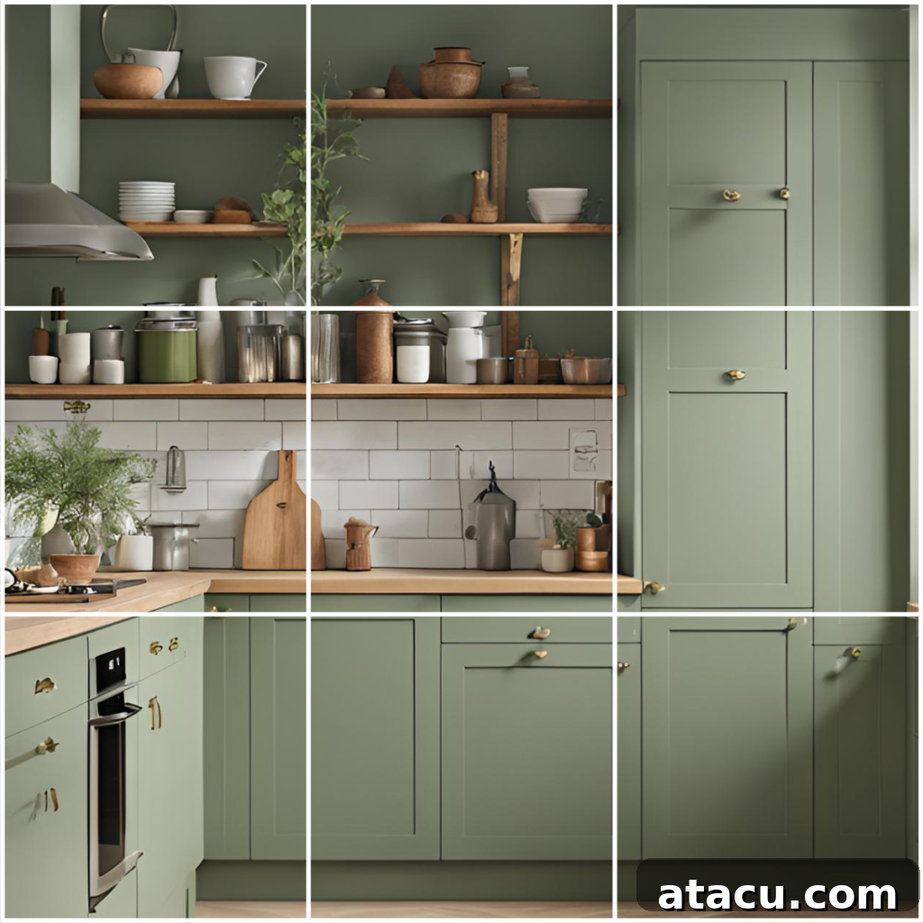
- Kitchen Functionality & Style: Envision a kitchen backsplash visually divided into thirds. The central third might feature a stunning range hood and stove. One of the outer thirds could be highlighted with open shelving displaying curated dinnerware or unique art, drawing the eye and adding personality. The remaining third could be simpler, featuring continuous cabinetry, creating a sense of dynamic balance across the entire wall.
- Dining Room Elegance: In a dining room, a large buffet or sideboard could be aligned with one of the horizontal thirds of a wall. Above it, a significant piece of art or a mirror could be placed at one of the grid’s intersection points, creating a natural focal point for the room without being overly formal or centered.
- Home Office Productivity: For a home office, consider your desk setup. Instead of pushing your desk flush against the center of a wall, position it so that it aligns with one of the vertical thirds. Flank it with a tall bookshelf or a plant at an intersection point, providing visual balance and creating distinct zones for work and storage within the same wall space.
The Rule of Thirds is more than just a fleeting trend; it’s a foundational design principle that offers a reliable framework for creating spaces that feel inherently beautiful, organized, and inviting. By consciously applying this method to arrange furniture, place art, and style your room, you can elevate your interiors from merely functional to effortlessly balanced and visually compelling. It empowers you to craft environments that are not only aesthetically pleasing but also feel intuitively right, enhancing the overall experience of your home.
Looking to master the art of interior design and create spaces that truly inspire? The Rule of Thirds is just one powerful piece of the puzzle. Expand your design knowledge further and discover another timeless principle to elevate your space: check out our comprehensive guide to the 60-30-10 rule for interior design.
For Future Inspiration