Embarking on the journey of selecting the perfect paint colors for your home is an exciting endeavor, yet it can quickly become an overwhelming challenge. The right color palette possesses the transformative power to create an atmosphere that feels not only harmonious and inviting but also deeply personal. Conversely, making ill-informed color choices can lead to a space that feels disjointed, out of balance, or even unwelcoming, potentially causing regret and the need for costly repainting down the line. A little foresight and strategic planning can prevent these common pitfalls and ensure your home reflects your vision from the outset.
To help navigate these complexities, the renowned Nordic paint brand Tikkurila has identified four pervasive color mistakes that frequently undermine the aesthetic appeal and overall feel of a home. Understanding these common errors is the first step towards creating a truly captivating and comfortable living environment.
1. Overlooking the Impact of Natural Light
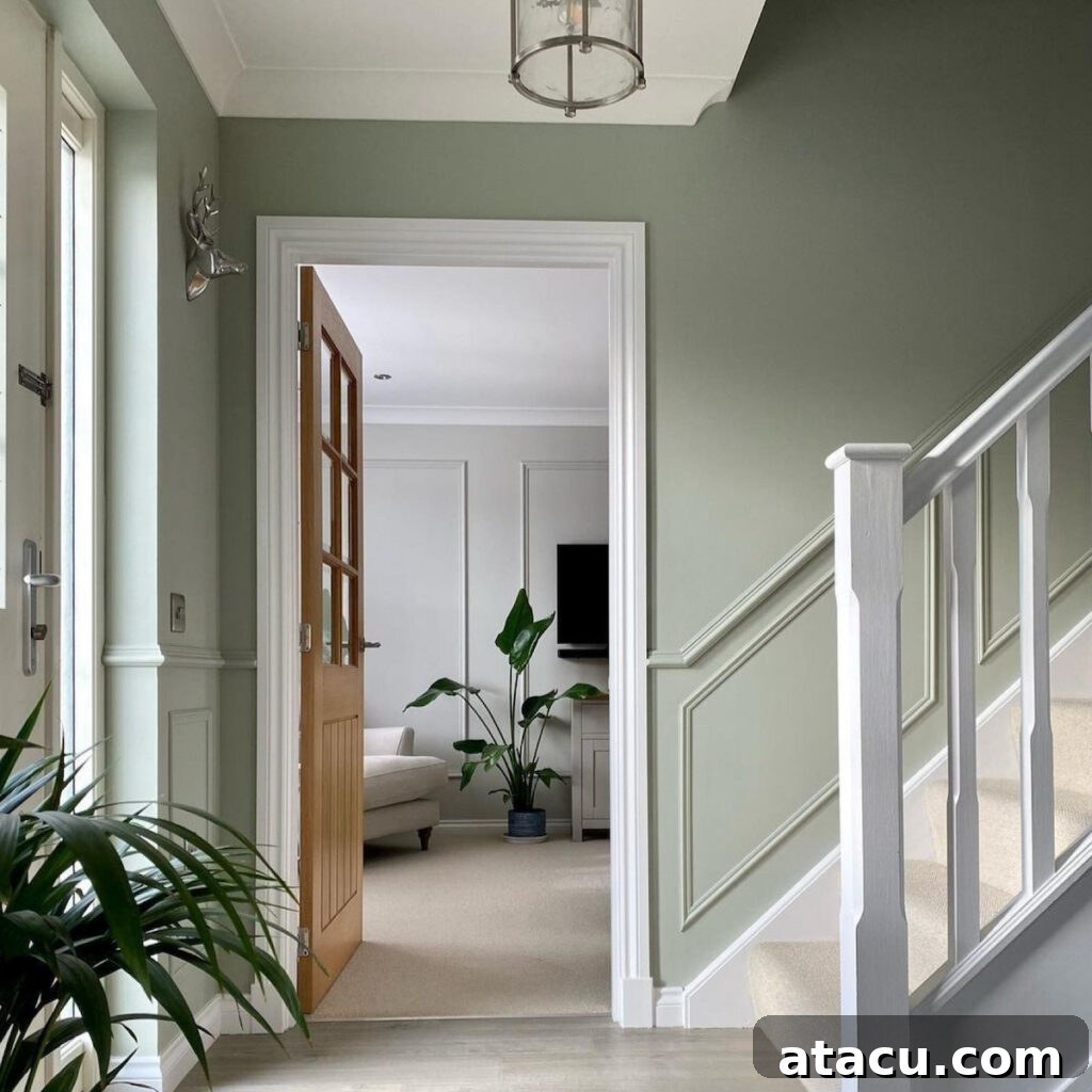
One of the most critical, yet often underestimated, factors in color selection is natural light. The way paint colors appear can dramatically shift throughout the day, influenced by the intensity, direction, and color temperature of the sun. A seemingly warm beige chip viewed under fluorescent store lights might transform into a surprisingly dull, cool grey when applied to a wall in a north-facing room, leaving homeowners baffled and disappointed. This chameleon-like behavior of color makes understanding your room’s natural light a non-negotiable step in the decision-making process.
- South-facing rooms are blessed with an abundance of warm, bright sunshine for most of the day. This intense light can amplify the warmth in paint colors, making already warm tones appear even more vibrant or potentially overpowering. To maintain a sense of calm and balance, cooler shades such as soft blues, tranquil greens, or gentle lavenders can be incredibly effective. They absorb some of the excessive warmth, creating a refreshing and airy ambiance.
- North-facing rooms receive cooler, indirect, and often subdued light. This light quality can make colors appear flatter, cooler, and sometimes even darker than anticipated. To counteract this cool cast and infuse warmth into the space, opt for hues with inherent warmth. Think soft, buttery yellows, inviting earthy browns, delicate peachy tones, or creamy off-whites. These colors can visually lift the room, making it feel cozier and more illuminated despite the limited natural light.
- East and west-facing rooms present a unique challenge as their lighting conditions undergo significant transformations throughout the day. East-facing rooms experience bright, warm morning light, which fades into cooler tones in the afternoon. West-facing rooms are bathed in cooler morning light, transitioning to intense, warm afternoon and evening sun. Due to these dynamic shifts, it is absolutely essential to test large sample swatches directly on your walls. Observe how the chosen color interacts with the light at various times of the day—morning, noon, and evening—to understand its full range and ensure it meets your expectations across all conditions.
A simple yet highly effective trick to master this challenge is to paint large sample swatches (at least 2’x2′) on multiple walls within the room. Observe these samples over several days, noting how the color behaves under different natural light conditions, and even under artificial lighting at night. This diligent approach will illuminate the true character of your chosen hue.
2. Pairing Colours with Conflicting Colour Temperatures Without a Plan
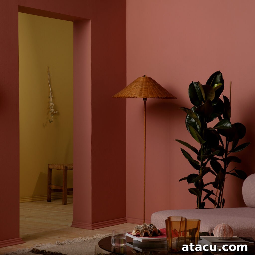
The interplay of warm and cool tones can undeniably create visual interest and dynamic contrast within a space. However, when these conflicting color temperatures are combined without a deliberate, cohesive plan, the result can often be a room that feels disjointed, chaotic, or simply “off.” Imagine the visual discord of an overtly warm, golden beige sofa placed against an icy, stark blue wall; while theoretically a contrast, without careful consideration of undertones and unifying elements, the pairing can feel jarring and mismatched, lacking a sense of intentional design.
Understanding color temperature is fundamental: warm colors (reds, oranges, yellows) are associated with energy and coziness, while cool colors (blues, greens, purples) evoke tranquility and spaciousness. The key to successfully integrating them lies in thoughtful execution.
To make mixed temperatures work harmoniously in your home:
- Establish a Dominant Temperature: Decide whether your room will primarily lean towards a warm or a cool palette. Once a dominant temperature is chosen, the opposing temperature can be introduced in smaller, accent doses. For instance, a predominantly cool room with grey walls might incorporate warmth through golden-toned wooden furniture or vibrant yellow throw pillows. This ensures the eye has a primary anchor to rest upon.
- Utilize Neutral Shades as a Bridge: Neutrals are the unsung heroes of interior design, particularly when bridging disparate color temperatures. Shades like soft greys, creamy whites, sophisticated taupes, or muted charcoals possess undertones that can lean both warm and cool, making them ideal transitional hues. They act as a visual buffer, allowing warm and cool elements to coexist gracefully without clashing. For example, a warm wood floor can seamlessly meet a cool blue wall if a neutral rug or furniture piece is placed between them.
- Introduce Warmth Through Natural Materials: If your chosen paint palette skews cool, incorporating warmth through natural materials is an excellent strategy. Elements such as rich wooden furniture (oak, walnut), textured woven rugs (jute, sisal), warm metal accents (brass, copper), or plush textiles (wool, linen) can ground the space and inject an organic warmth that complements cooler wall colors beautifully. Similarly, in a predominantly warm room, cooler accents like polished chrome hardware or stone textures can provide a refreshing counterpoint without disrupting the overall warmth. Consider the undertones of all elements in the room – from flooring and fabrics to artwork and accessories – to ensure a cohesive and balanced feel.
3. Overusing Dark Colours
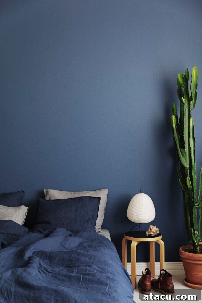
Dark hues possess an undeniable allure; they can imbue a room with a sense of drama, sophistication, and intimacy. Think of deep navy, charcoal grey, or rich forest green – these colors are potent and can transform a space. However, their power is a double-edged sword. Applying too much dark color throughout an entire room can inadvertently lead to an oppressive, heavy atmosphere, making the space feel significantly smaller and less inviting, almost cave-like. The key to harnessing the elegance of deep tones lies in achieving a precise balance.
- Strategic Application is Paramount: Rather than painting all four walls in a dark shade, use these powerful colors strategically. Consider a single accent wall to create a focal point, define specific zones within an open-plan space, or highlight architectural features. Dark trim, such as window frames or baseboards, can provide a sophisticated contrast to lighter walls. Even a dark ceiling in a room with ample natural light and high ceilings can create a surprisingly cozy, enveloping effect. These thoughtful applications maximize impact without overwhelming the space.
- Embrace the 60-30-10 Rule: This classic interior design principle is invaluable for creating balanced color schemes. It suggests that 60% of a room should be in a dominant color (often a lighter, more neutral shade), 30% in a secondary color (which can be a mid-tone or a contrasting hue), and 10% in a bold accent color. The accent color is where dark hues truly shine. For example, in a living room, your walls might be a soft off-white (60%), the sofa and large furniture pieces a muted grey (30%), and deep navy throw pillows, an accent chair, or a dramatic piece of art (10%) provide that sophisticated dark touch. This rule ensures that dark colors enhance, rather than dominate, the overall aesthetic.
- Prioritize and Optimize Lighting: When incorporating deep shades, lighting becomes an even more critical component. If your room has limited natural light, simply painting it dark will likely make it feel gloomy. To counteract this, balance deep wall colors with abundant, well-planned lighting. Incorporate multiple light sources: ambient lighting (overhead fixtures), task lighting (desk lamps, reading lamps), and accent lighting (picture lights, spotlights) can all work together to brighten and layer the space. Furthermore, pair dark walls with lighter elements such as furniture, rugs, curtains, and accessories. Reflective surfaces like mirrors, glass, and polished metals can bounce light around the room, preventing a heavy, closed-in feeling and adding a touch of glamour.
By treating dark colors as an element of design rather than the entirety, you can create spaces that are rich, luxurious, and beautifully inviting, without sacrificing light or a sense of spaciousness.
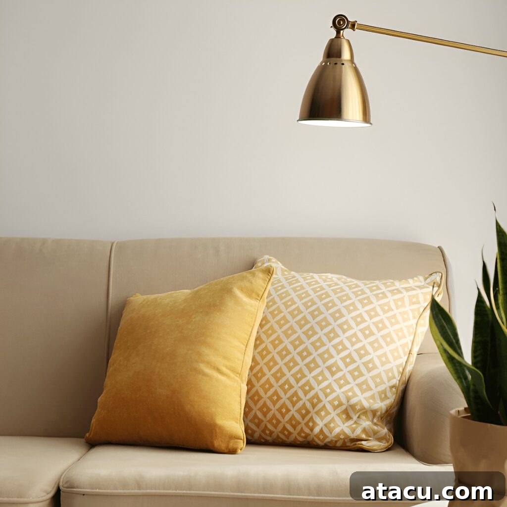
4. Choosing Colours That Don’t Suit the Room’s Purpose
Paint color is far more than just an aesthetic choice; it’s a powerful psychological tool that profoundly influences mood, energy levels, and the overall functionality of a space. The colors you are personally drawn to for their beauty might not always be the most supportive or appropriate for the specific activities and atmosphere you wish to cultivate in a particular room. Understanding the inherent psychological properties of colors and matching them to the room’s intended purpose is crucial for creating an environment that feels both beautiful and inherently right.
- For a Home Office or Creative Workspace: Productivity and focus are paramount here. Energizing shades can boost concentration and spark creativity. Consider mustard yellows for their intellectual stimulation and optimistic feel, or vibrant blues which are known to enhance focus and mental clarity. Greens, particularly those found in nature, can also promote a sense of calm and balance, reducing eye strain during long working hours. Avoid overly distracting or somber colors that might drain energy.
- Living Rooms, Family Rooms, and Dining Areas: These communal spaces are designed for gathering, relaxation, and conversation. They benefit immensely from warm, inviting, and comforting tones. Earthy neutrals like soft taupes, inviting creams, and gentle greiges create a backdrop that feels hospitable. Warm greens, muted oranges, and subtle reds can add depth and a sense of coziness without being overly stimulating. The goal is to foster an atmosphere where guests and family members feel relaxed and encouraged to linger.
- Bedrooms and Private Retreats: The primary function of a bedroom is rest and rejuvenation. Therefore, the color palette should lean heavily towards calming, soothing, and serene hues. Soft greens, with their connection to nature, promote tranquility. Muted blues are known for their calming effects, reducing stress and aiding sleep. Gentle lavenders and soft purples can also foster a peaceful and luxurious ambiance. Even soft, muted pinks can create a restful and romantic feel. Steer clear of overly bright or intense colors that might hinder relaxation.
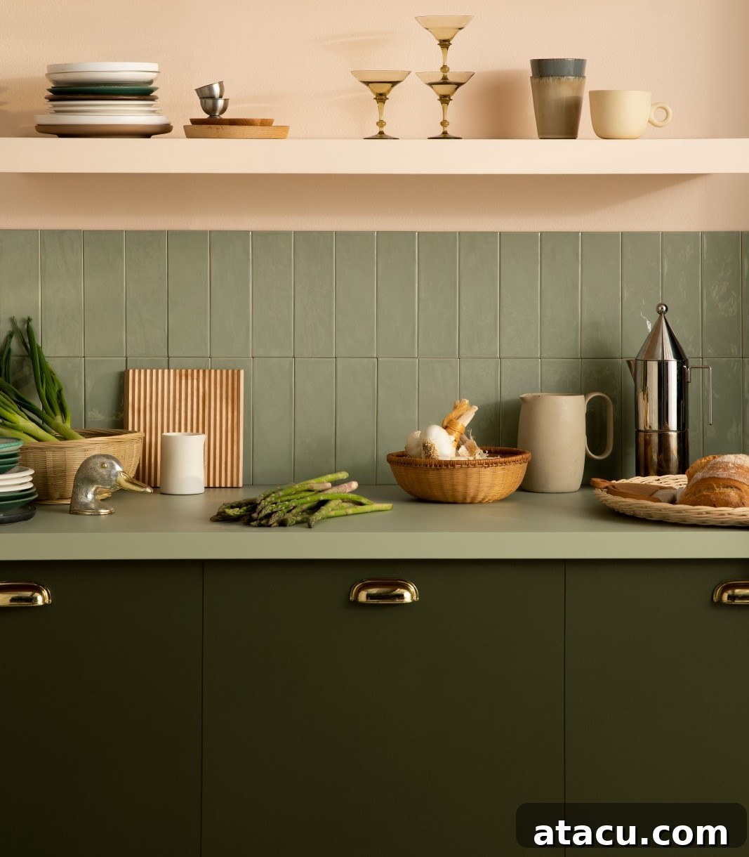
- Kitchens: The Heart of the Home: Kitchens are often busy, functional spaces that also serve as gathering points. Fresh, timeless shades work best, creating an environment that feels clean, vibrant, and inviting. Sage green, for instance, is a fantastic choice; it brings a refreshing sense of nature and calm while still feeling lively and approachable. It pairs exquisitely with natural wood cabinetry, crisp white accents, and elegant marble or granite countertops, creating a sophisticated yet down-to-earth aesthetic. Other popular choices include clean whites, soft greys, and even pale blues for a fresh, airy feel.
While staying abreast of trendy colors and making bold design statements can inject freshness and uniqueness into your home, the ultimate success lies in ensuring these choices genuinely support and enhance your everyday lifestyle and the specific activities that take place within each space. Prioritize purpose over fleeting trends for lasting satisfaction.
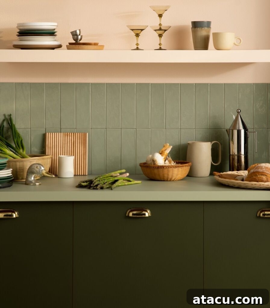
Creating a Cohesive and Inviting Home: Your Guide to Confident Color Choices
The power of a well-chosen color scheme cannot be overstated; it’s the foundation upon which the entire ambiance and character of your home are built. By consciously avoiding these four common color mistakes, you embark on a path towards creating a living space that feels not only aesthetically pleasing but also profoundly cohesive, inviting, and truly reflective of your personal style. Thoughtful consideration of natural light ensures colors appear as intended, while maintaining a balanced color temperature prevents visual discord. Utilizing dark tones wisely adds drama without making rooms feel constrained, and matching colors to each room’s specific function enhances both mood and usability. Each of these elements works in concert, enabling you to craft an environment that feels effortlessly stylish, comfortable, and uniquely yours.
Armed with these insights, you can approach your next home decorating project with newfound confidence, transforming your spaces into sanctuaries of color and calm. Remember, successful interior design is not about rigid rules, but about understanding principles that allow for creative, informed choices. By carefully planning your palette, your home will radiate warmth, character, and an undeniable sense of welcome.
Images courtesy of Tikkurila.
📌 Found these expert color tips helpful? Don’t let them fade away! Pin this guide to Pinterest now so you can easily refer back to these invaluable insights whenever you’re planning your next home refresh!
Save to Pinterest