
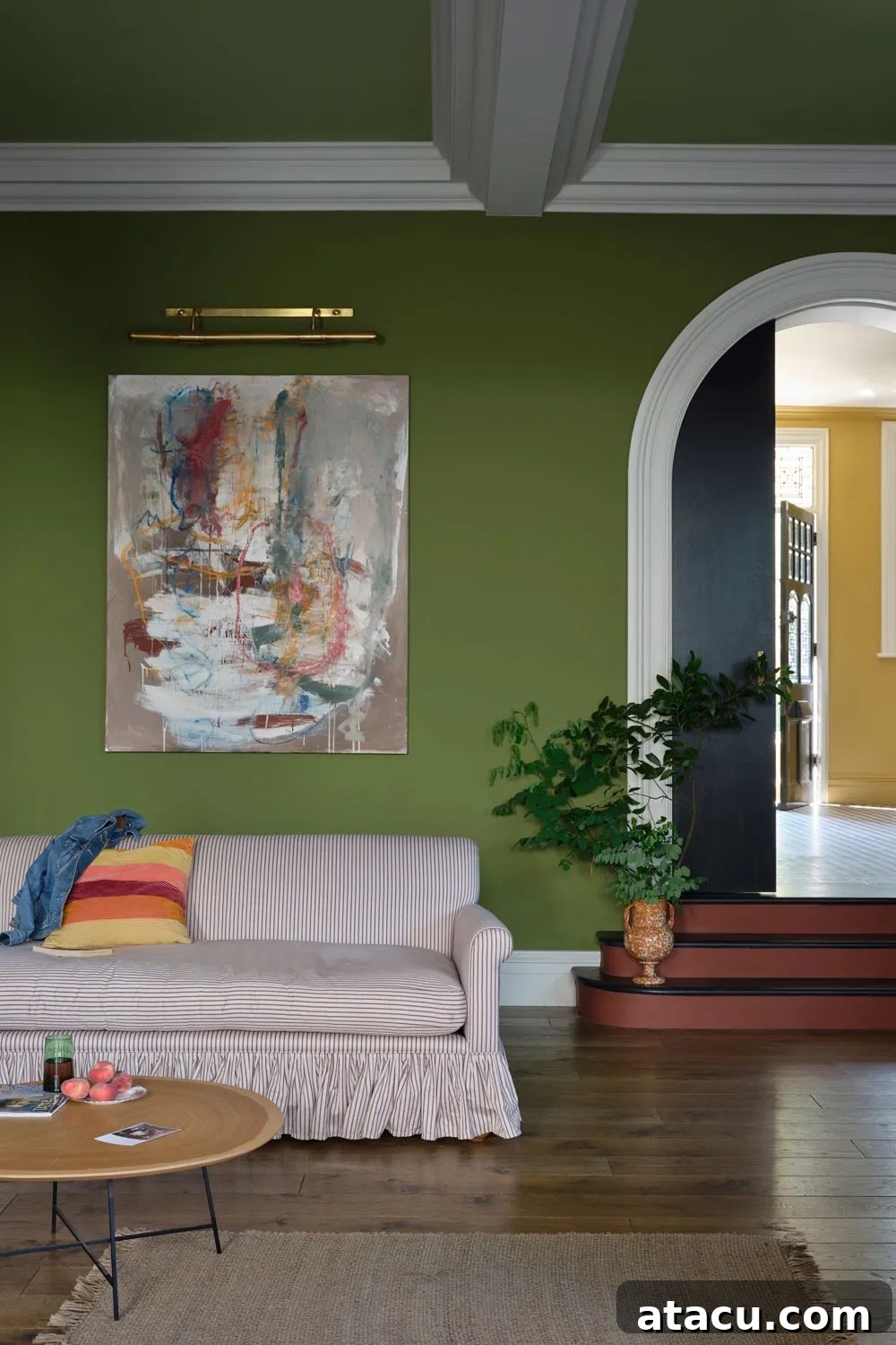
Colour enthusiasts and interior design aficionados, rejoice! Farrow & Ball, the esteemed British purveyor of exceptional paints and wallpapers, is once again expanding its iconic and carefully curated palette. This eagerly anticipated launch introduces nine captivating new shades, alongside the triumphant return of three beloved favourites from their extensive archives. Set to debut on February 27th, this collection promises a harmonious blend of rich, grounded tones, each meticulously crafted to transform and elevate everyday living spaces into extraordinary sanctuaries.
Farrow & Ball, renowned for its unparalleled depth of colour and eco-friendly formulations, describes this collection as a celebration of the ‘extraordinary ordinary.’ Their statement perfectly encapsulates the philosophy behind these new additions: “For the first time, brand-new creations are joining our signature palette alongside Archive colours we’re welcoming back. These grounded shades celebrate, illuminate and indulge in the everyday. The unsung heroes of our fondest memories and the special touches that make a moment an occasion. The extraordinary ordinary.” This sentiment resonates deeply with those seeking to infuse their homes with colours that not only look beautiful but also evoke comfort, nostalgia, and a profound connection to the natural world.
The new additions boast evocative names that hint at their unique character and inspiration. Among them, Marmelo, drawing its essence from the quince fruit used in traditional marmalade, offers a warm, comforting orange hue. Other intriguing names like Dibber, Scallop, Sap Green, and Broccoli Brown promise the same unmistakable depth, character, and timeless appeal that Farrow & Ball is celebrated for. Each shade tells a story, inviting homeowners and designers to explore possibilities that transcend mere decoration, creating spaces that feel inherently ‘right.’
In a world often saturated with fleeting trends, Farrow & Ball’s approach stands out. Their new collection is a testament to enduring style, focusing on versatile colours that beautifully complement both contemporary and traditional interiors. These shades are designed to be lived with, evolving with the light throughout the day and offering subtle nuances that reveal themselves over time. Whether you’re planning a complete home renovation, a refreshing room makeover, or simply seeking inspiration, this new palette offers a wealth of options to explore. Dive in below for an exclusive sneak peek at these magnificent colours and let your imagination soar for your next design project.
Farrow & Ball Etruscan Red: A Timeless Earthy Statement
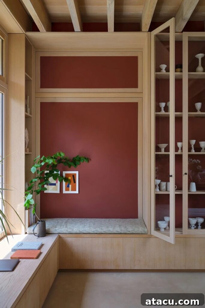
Reintroduced from the cherished Farrow & Ball archive, Etruscan Red emerges as a beautifully aged, earthy red, imbued with subtle yet profound deep brown undertones. This captivating hue possesses the rich, time-worn quality often associated with ancient terracotta, making it a colour that speaks of history and heritage. Etruscan Red is bold enough to make a significant statement in any room, yet it achieves this without ever feeling overwhelming. Its sophisticated depth offers a grounding warmth, perfect for creating an inviting atmosphere in living rooms, dining areas, or studies. Imagine it paired with natural wood finishes, soft linen textiles, or even touches of brass for an opulent yet comfortable feel. This shade beautifully complements traditional settings, adding an authentic historical touch, but can also bring unexpected warmth and character to more contemporary minimalist spaces. It’s an ideal choice for those seeking a colour with genuine personality and a sense of enduring elegance.
Farrow & Ball Reduced Green: The Elusive Sophisticate
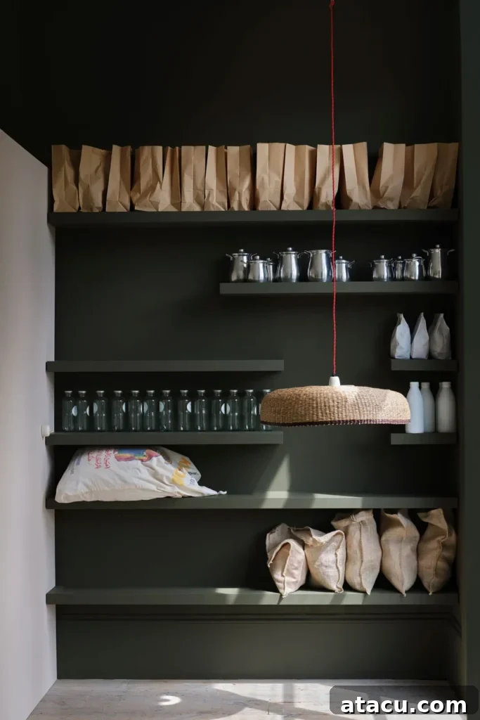
Reduced Green is one of those wonderfully elusive shades that seems to shift and transform with the changing light, appearing sometimes as a rich green and at other moments revealing deeper brown characteristics. This deep, muted, and undeniably characterful hue is the perfect choice for anyone desiring a grounding colour that exudes effortless sophistication. Its chameleon-like quality adds an intriguing layer of complexity to a space, preventing it from ever feeling static. Reduced Green brings the calming influence of nature indoors, making it ideal for creating serene bedrooms, elegant studies, or a sophisticated kitchen pantry, as shown in the stunning image. It pairs beautifully with warm neutrals, natural timber, and even touches of deep blues or muted ochres, creating a truly harmonious and refined scheme. This colour embodies a quiet luxury, appealing to those who appreciate subtlety and depth over overt vibrancy.
Farrow & Ball Broccoli Brown: Earthy and Understated
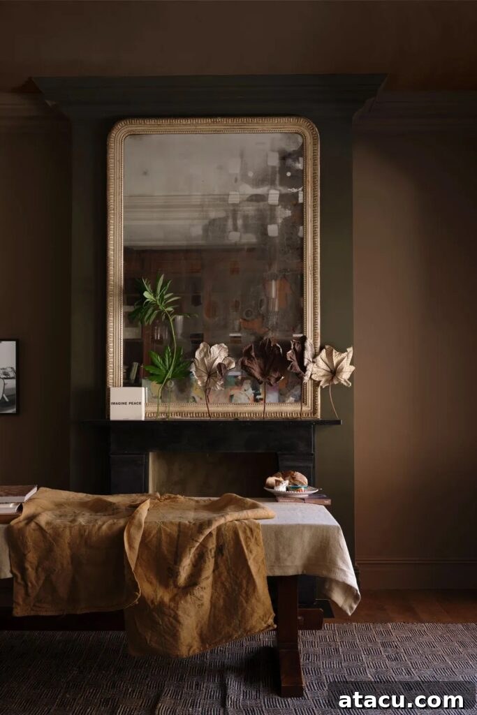
Broccoli Brown introduces itself as a deep, earthy shade that manages to feel both profoundly grounding and remarkably understated. Its quiet, stony quality makes it an incredibly versatile colour that will pair effortlessly with a wide array of natural materials, from aged wood and flagstone floors to linen and wool textiles. This hue evokes the comforting embrace of the natural world, bringing a sense of calm and stability to any interior. Imagine it creating a serene backdrop in a living room, a deeply comforting atmosphere in a bedroom, or adding a sophisticated edge to a hallway. Broccoli Brown is particularly well-suited for rustic, wabi-sabi, or contemporary organic interior design styles, where its subtle complexities can truly shine. It provides a perfect foil for brighter accents or allows a space to exist in a tranquil, contemplative state, making it a must-consider for those seeking natural elegance.
Farrow & Ball Sap Green: The Classic Olive Elegance
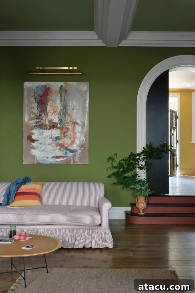
Sap Green is a truly classic olive shade – deep, natural, and inherently grounding. It’s a colour that feels instantly familiar, reminiscent of lush foliage and traditional country estates. Perfect for creating a rich, inviting feel, this hue works exceptionally well in both expansive and smaller spaces, where its depth can add character without overwhelming the room. Its connection to nature makes it a superb choice for spaces that aim to foster a sense of tranquility and warmth, such as living rooms, studies, or even a cozy kitchen. Sap Green beautifully complements natural wood tones, antique furnishings, and even vibrant artworks, creating a sophisticated and timeless aesthetic. For those looking to inject a touch of verdant elegance into their home, Sap Green offers a refined and enduring option that will enhance any interior scheme.
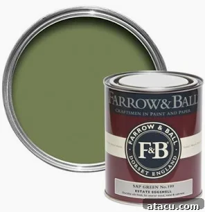
Farrow & Ball Sap Green Emulsion Paint, 2.5L
Farrow & Ball Duster: The Comfort of Worn Yellow
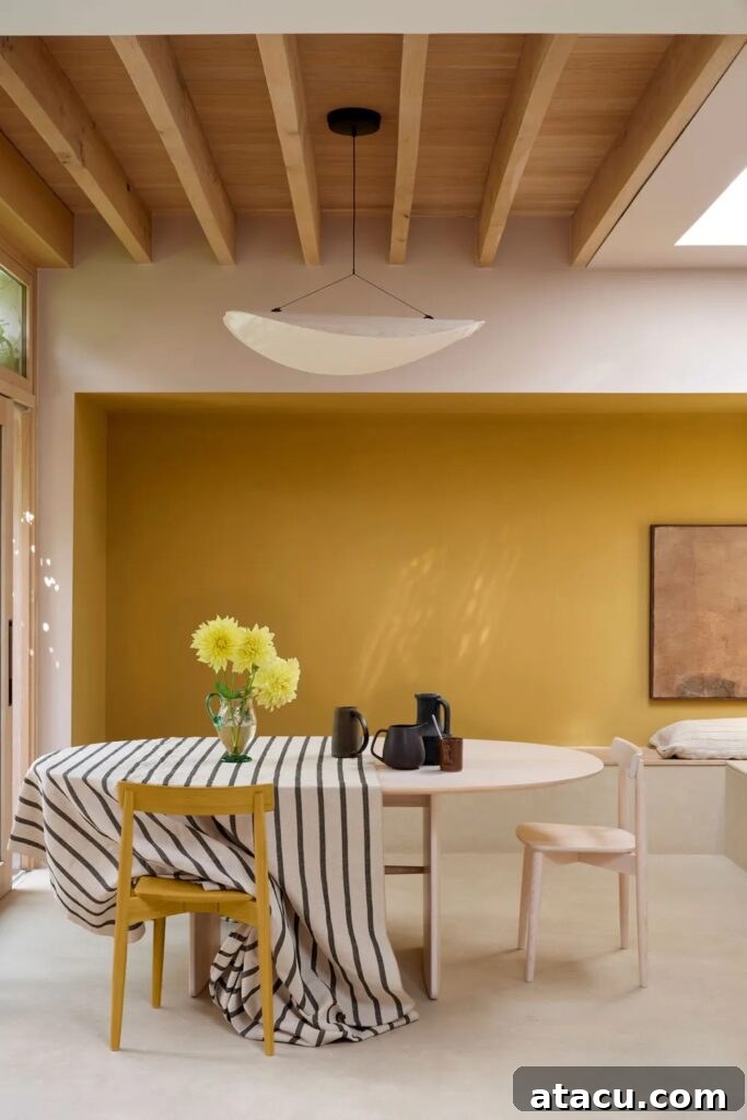
Duster is that perfectly rendered, well-worn yellow, evoking the humble cleaning cloth that has been used countless times, yet still reliably performs its duty. It’s a colour saturated with warmth, carrying a slightly aged quality that lends it immense character and a profound sense of comfort. Unlike brighter, more assertive yellows, Duster offers a mellow, sun-baked charm that is incredibly inviting. This shade is particularly effective in spaces that benefit from a boost of warmth, such as north-facing rooms or areas where you want to foster a cozy, welcoming ambiance. Imagine it gracing the walls of a kitchen, a cheerful dining room, or a sunroom, bringing a gentle radiance. Duster pairs beautifully with soft greens, muted blues, and natural wood tones, creating an effortlessly relaxed and homely feel. It’s a colour that feels like a warm embrace, perfect for creating joyful and comforting interiors.
Farrow & Ball Dibber: Deeply Connected to Nature
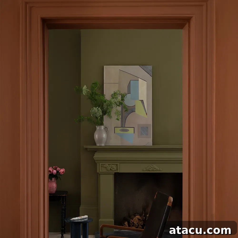
Dibber is a rich, earthy green that feels intrinsically connected to the natural world. With its slightly muddied, authentic tone, it brings both warmth and significant depth to a space without ever feeling overly bold or overpowering. This makes it an exquisite choice for those who are drawn to greens but desire something a little softer, more lived-in, and less vibrant than a pure botanical green. Dibber works beautifully to create a cozy, cocooning atmosphere in bedrooms, an intimate feel in living rooms, or a sophisticated backdrop in a study. It harmonizes wonderfully with neutral tones like soft creams and warm greys, but also pairs strikingly with muted pinks or deeper terracotta shades, creating compelling contrasts. Its grounding presence makes it an excellent foundation for a variety of interior styles, from classic to contemporary, adding a layer of organic sophistication.
Farrow & Ball Scallop: The Refined Neutral with a Hint of Pink
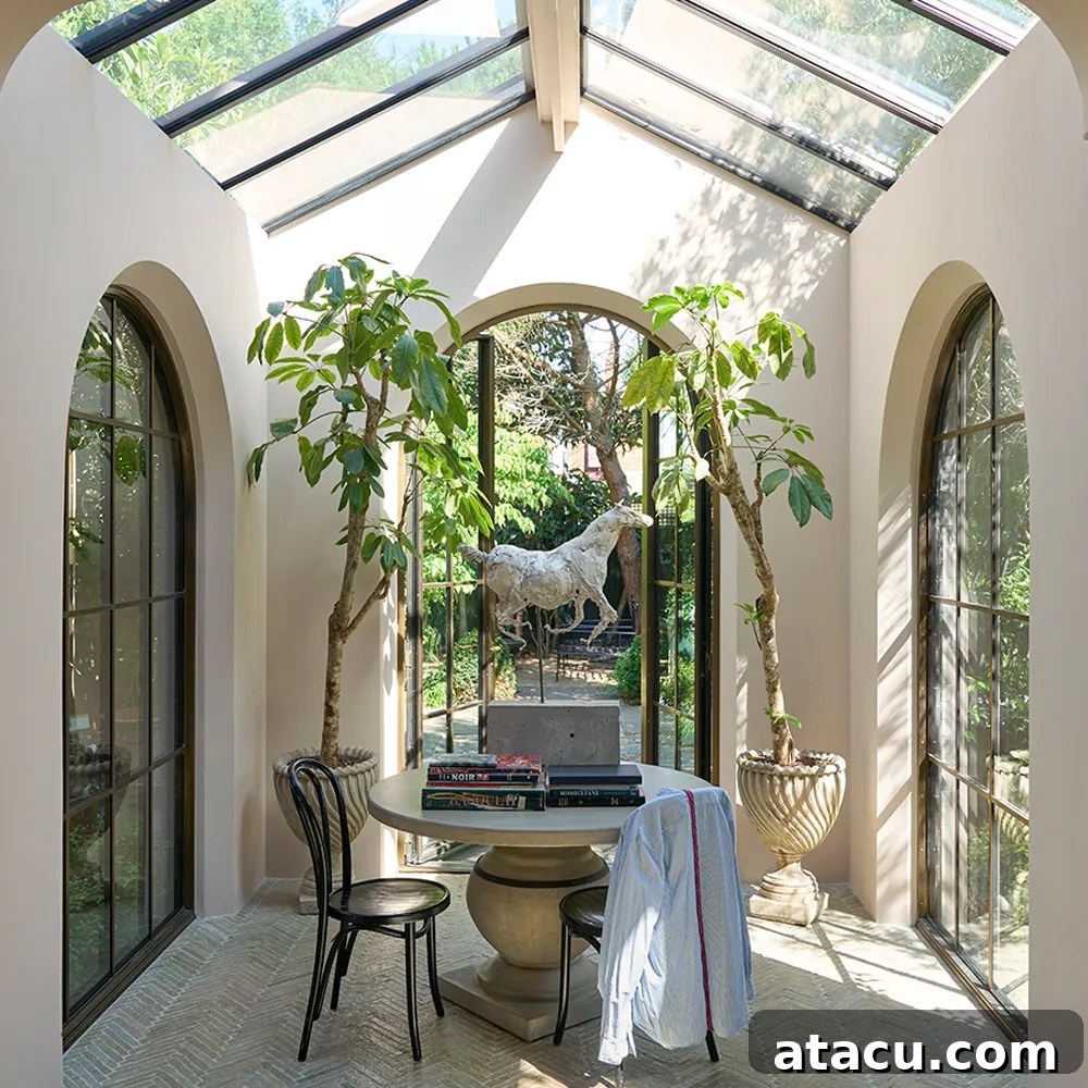
‘Scallop’ presents itself as a soft, warm neutral colour with a delicate, almost imperceptible hint of pink. This subtle undertone is key to its appeal, as it brings an understated warmth to any space, making it feel instantly more inviting and less stark than traditional off-whites. More refined and nuanced than a classic neutral, Scallop offers a gentle yet sophisticated alternative for those seeking a light, airy tone without the cool undertones often found in grey-based shades. It is perfect for creating bright, serene environments in conservatories, sunrooms, or bedrooms, where its warmth can truly shine. Scallop also acts as an excellent backdrop for natural textures, light wood furnishings, and even soft pastel accents, allowing other elements in the room to come forward while maintaining a harmonious balance. It’s a versatile shade that promises quiet elegance and a comforting glow.
Farrow & Ball Marmelo: The Warmth of Sunbaked Quince
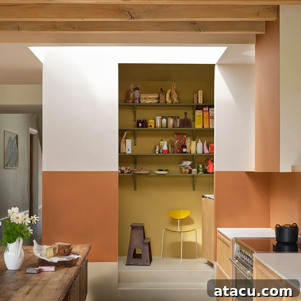
Marmelo is a colour that perfectly captures the essence of a beautifully ripened quince – warm, mellow, and inherently earthy. It possesses a natural, sunbaked softness that feels instantly comforting and welcoming. This hue is a sublime choice for spaces where warmth and an organic feel are paramount, such as kitchens, dining rooms, or living areas where you want to evoke a sense of Mediterranean charm or rustic elegance. Its gentle warmth ensures it can pair equally well with deep greens and blues for a contrasting effect, or with other natural tones like creams and terracotta for a harmonious scheme. Marmelo brings a subtle vibrancy that is never overpowering, making it a versatile and endearing addition to the Farrow & Ball palette. It encourages a relaxed atmosphere, making it ideal for creating inviting and lived-in spaces that exude a gentle, sun-kissed glow.
Farrow & Ball Sizing: Fresh, Effortless Elegance
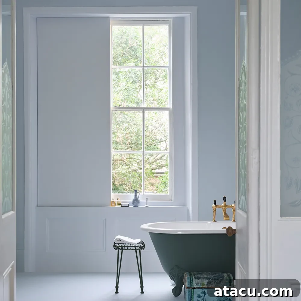
Sizing introduces itself as a cool, blue-based neutral colour that embodies fresh, effortless elegance. Its inherent crispness ensures that any space painted in Sizing feels light, airy, and refined, making it an ideal choice for creating a calm yet sophisticated backdrop. This versatile shade is particularly well-suited for bathrooms, serene bedrooms, or hallways where you desire a sense of spaciousness and tranquility. Sizing provides a clean canvas that beautifully accentuates architectural details and allows other elements within the room, such as furniture or artwork, to truly stand out. It pairs wonderfully with crisp whites for a classic, fresh look, light natural woods for a touch of organic warmth, or even contrasting dark accents to create a more dramatic effect. Sizing is a testament to the power of a well-chosen neutral to transform an interior into a sanctuary of peace and understated style.
Farrow & Ball Naperon: Terracotta with Character
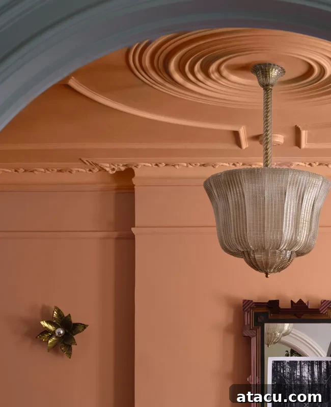
Naperon is a terracotta shade imbued with real character – a warm, familiar colour that is utterly full of depth, much like a cherished piece of well-loved pottery. This hue carries an artisanal quality, suggesting craftsmanship and an authentic connection to the earth. Its rich, inviting warmth makes it perfect for creating spaces that feel cozy, grounded, and intimately personal. Naperon can transform a dining room into a convivial gathering place, add a touch of rustic charm to a kitchen, or create a wonderfully bohemian vibe in a living area or bedroom. It pairs beautifully with natural materials such as unpolished wood, woven textiles, and aged metals. Consider pairing Naperon with deep blues or greens for a striking contrast, or with other warm neutrals for a harmonious, earthy scheme. This colour is an excellent choice for those looking to infuse their home with personality, comfort, and a timeless, handcrafted appeal.
Farrow & Ball Kakelugn: Serene Scandinavian Blue
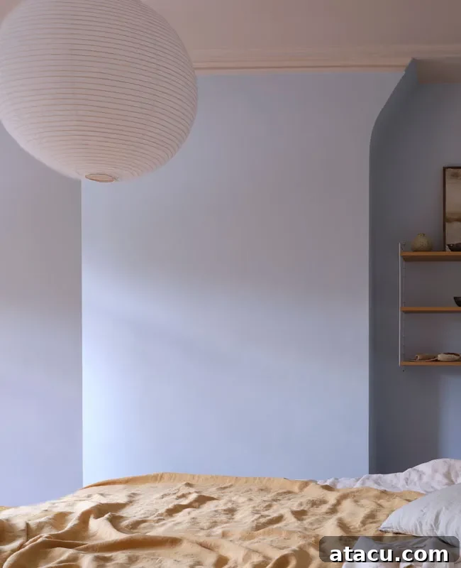
Kakelugn offers a fresher, cleaner interpretation of Farrow & Ball’s beloved classic ‘Light Blue.’ This exquisite shade embodies a soft, airy tone that feels effortlessly calming and utterly serene. Drawing subtle inspiration from traditional Swedish tiled stoves (Kakelugn), which are often adorned in tranquil blue and white hues, this colour brings a touch of refined Scandinavian tranquility to any interior. Kakelugn is an exceptional choice for bedrooms, nurseries, or any space where you wish to foster a peaceful and restful atmosphere. Its gentle quality makes rooms feel more expansive and filled with soft, diffused light. It harmonizes beautifully with crisp whites, pale greys, and light natural woods, enhancing a minimalist or Scandinavian-inspired aesthetic. For those seeking a delicate blue that promises quietude and understated beauty, Kakelugn provides an elegant and refreshing solution, creating spaces that invite relaxation and contemplation.
Farrow & Ball Douter: Moody, Atmospheric Grey-Green
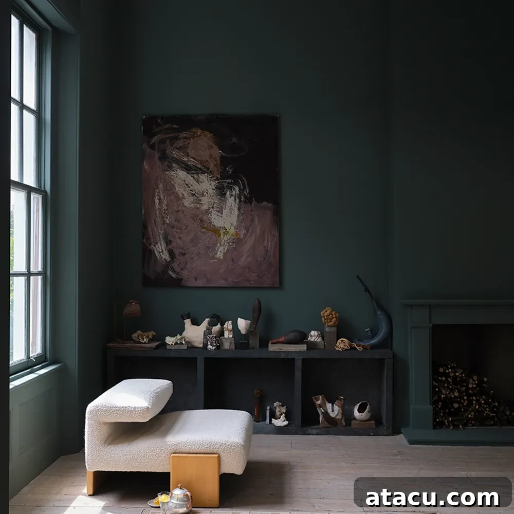
Douter is a truly captivating moody, atmospheric grey-green that boasts a beautifully smoky depth. This sophisticated hue can be seen as a greener, perhaps softer, take on Farrow & Ball’s immensely popular ‘Inchyra Blue,’ sharing its dramatic potential while leaning more towards an organic, verdant undertone. Douter is ideal for creating intimate and luxurious spaces, perfect for a refined dining room, a cozy study, or an impactful accent wall in a living area. Its profound depth creates a cocooning effect, making large rooms feel more enclosed and small rooms feel incredibly rich and jewel-like. It pairs wonderfully with dark, richly grained woods, polished brass accents, and deep jewel tones like ruby or amethyst, for a truly opulent scheme. Douter is a colour for those who aren’t afraid to embrace depth and drama in their interiors, promising a sophisticated and evocative ambiance that will leave a lasting impression.
This latest collection from Farrow & Ball masterfully combines the brand’s heritage with a keen eye for contemporary design desires. Each of the new and re-released shades is a testament to their commitment to quality, depth, and the creation of colours that truly transform a home. By focusing on grounded, earthy tones, Farrow & Ball encourages us to find beauty in the ‘extraordinary ordinary,’ creating spaces that resonate with comfort, character, and timeless appeal. We encourage you to explore these captivating colours further, perhaps by ordering samples, and discover how they can bring a fresh perspective and enduring elegance to your own living spaces. Let Farrow & Ball inspire your next colour journey.
All images: Farrow & Ball